SOOOO we were tasked with making any of the 50 things with our choice. I choose the motor bike, and its not yet finished but its at most in my opinion at 25% done.
Currently there is still plenty of work to do so the finished version is gonna look much better.
Thursday, 15 December 2016
types of digital art
Types of digital art
in existing media products. Complete the table listing how digital art is used
in the following sectors:
Sector
|
Types
of digital art used e.g. logo etc.
|
Two
Relevant Examples
|
Image/s
|
||||
moving
Image, e.g.
|
Videos, movies
|
The Walking Dead, Naruto, Bleach
|
|||||
e-publishing,
e.g.
|
Books, novels, etc.
|
||||||
web
art, e.g.
|
Pop art, Urban, sci-fi.
|
Travis Lacey, Banksy
|
|||||
digital
Games, e.g.
|
Graphics, animations, charecters, monters.
|
Mass effect, dead space |
|
Thursday, 8 December 2016
Typographic Hierarchy 2
This is the four examples that were last time rather bland, these now have different sizes and styles of writing and as you can see they look very different from before.
Luminari
12PT size.


Minion pro
13PT size.
Uniform stroke 0.35mm.
With black and dark green colours.
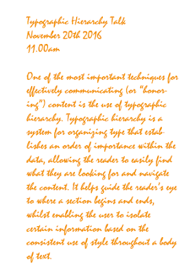
Mistral
14PT size.
Orange colour.
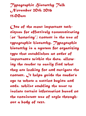
Matura MT Script Capitals
14PT size. Red rose colour.
Luminari
12PT size.


Minion pro
13PT size.
Uniform stroke 0.35mm.

Mistral
14PT size.
Orange colour.

14PT size. Red rose colour.
Typographic Hierarchy
Thursday, 1 December 2016
Task by Steve 2
This is a small ammount of the word transform in different forms, one being stretech, the other one being street art or very jelly/stretched.
There are plenty of combinations.
Here is this one with very swampy and muchy look. This time I used the pen tool to make them and not the type tool.
Task by steve
Type design can give your words a (1)voice It can really add meaning and enhance the (2)message of your words. For example, on the Dizzie album they have used some really (3)cheeky and chunky typography here. It not only (4)illustratesthe word but loads it with (5)charecter
and it's great for someone that has personality like Dizzie. In
contrast to this one, I've got the Saturdays album and the typography
here is really (6)elegant and beautifully crafted. It's much much more (7)feminine than the Dizzie one and it works very well with the fashionesque shoot
on the front. In total contrast to my last two albums, I've got the
Prodigy Dirtchamber sessions. They've used found and (8)disstresed type on the front cover and all the way through the album including the booklet where they've hand (9)scratched all the track names into the booklet. And I think this works really beautifully with the (10)mishmashof music that is on the CD.
 The Dizzee album is very "Jazzy" and very colourfull as well as showing the singer himself siting on some comic style rocks.

In this album the whole thing is very "serious" and is actualy really femenin not to mention it shows the whole band siting on a large pair of stairs with their dresses being a bright colour.
 This one is rather different, it doesnt show the band but a rather psychotic "scratching" of things and it kinda gives you an idea of what their music is.
 The Dizzee album is very "Jazzy" and very colourfull as well as showing the singer himself siting on some comic style rocks.
In this album the whole thing is very "serious" and is actualy really femenin not to mention it shows the whole band siting on a large pair of stairs with their dresses being a bright colour.
 This one is rather different, it doesnt show the band but a rather psychotic "scratching" of things and it kinda gives you an idea of what their music is.
Thursday, 24 November 2016
Test: Outline layers using Appearance panel and multiple strokes
This is my attempt at making multiple stroke outlines, and it proved very useful but this is just a test: I used Illustrators window appearance option to edit its outlines and looks not bad as a test.
Thursday, 10 November 2016
Private project: Obelisk
This was a private project that I was doing, it took me a few weeks to get it to look like this.
The idea was for the project was grabed from the faimous horror game Dead Space, with the obelisk getting scetched on paper then scaned and moved to Adobe Illustrator for editing.
When I finished making the outline by using the pencil tool I proceeded to colour them in, I encountered a problem with the outline being smooth it didnt create the effect I wanted but after changing the lines techture I started to add the details to the obelisk by ading the famous glowing red text.
I drew the lines but in the end they didnt need editing and I proceeded to edit the body of the obelisk to make it more gloomy and old in a way by darkening the lines on it.
When the obelisk was finished I went to edit the background and made it look like a dark orb behind it to add that destructive feel. I added th finishinf touches by adding the explosive orbs to the sides, the sky was also a problem and I fixed it by changing the state of the lines making them seem very "disturbed".
And boom, you have a rather good drawing of a dead space themed obelisk.
Know your styles
Pop art: very comic like, easily recognisable by people when seen.
Anime: easily the most butiful and still very popular style in the world
Thursday, 3 November 2016
Custom flower
So we were tasked with making a flower: you start by making a sircle, roughten it up to a degree you like scale it down or up by using the scaling tool then copy it, maybe change its rotation and edit its colour using the gradient tool and make it a nice litle branch of sorts to stand on.
Picture differances
So here are two versions of the same thing but both are different:
One is high resolution the other is low.
Now spot the difference with this one:
The same differance is with this one.
We had to compare the results as both images were different and as you can see you will be able to notice the differences rather easily if you have good eyesite.
One is high resolution the other is low.
The same differance is with this one.
We had to compare the results as both images were different and as you can see you will be able to notice the differences rather easily if you have good eyesite.
Raster vs Vectors
Raster Images
|
Vector Images
|
·
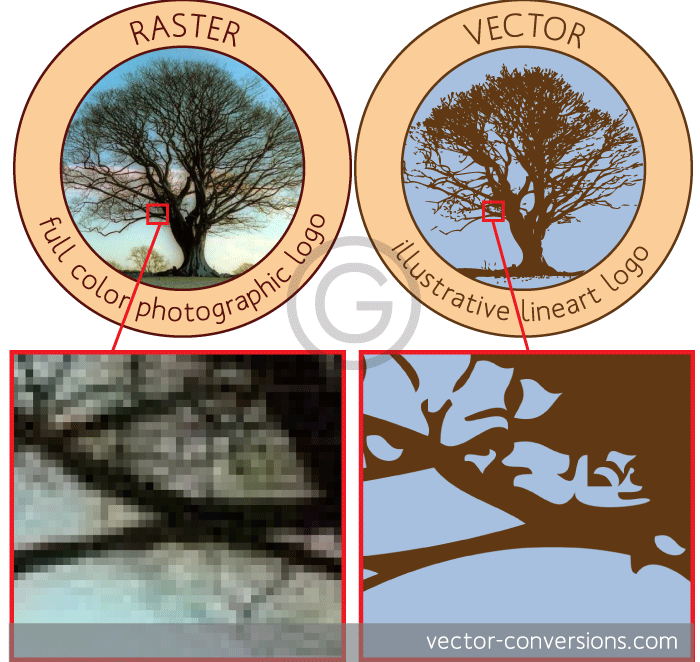
Created by thousands or
millions of pixels
·
Raster
images are made of pixels.
·
Photographs
are raster images and are probably the best example of images completely made
of color blends - or shade blends in the case of black and white photographs
· Some vector programs do have the ability to create color
gradients within one single shape, but these are actually raster effects.
·
A
raster image has a specific number of pixels. When you enlarge the image file
without changing the number of pixels, the image will look blurry.
·
|
·
Created by using
mathematical calculations
· Images with a subtle gradation of one color to another are
the images that will look most different since vector programs need to create
a separate shape for each shade of color.
·
Vector
images are mathematical calculations from one point to another
·
Vector
graphics can be scaled to any size without losing quality.
·
Not
real (many of them look like cartoon images)
·
EXAMPLE
BELOW OF BOTH:
 |
Thursday, 20 October 2016
PATHED WORDS/CHARECTERS
We were given the task to make a alighned word /charecter lines (beast description I could do) and as you can se all of them are in different colours, shapes and are all mentionning something different.
I first used a pencil or a spinnie your prefferance and the taped the type on path tool and wrote something I wanted and done. You can also change the size and the way they looked.
Regular test
In this test we were set a number of tasks to complete and as is shown here up top.
Tasks:
1. Change the red square to green.
2. Place a 1mm stroke around the red square. Place a 4 mm stroke around the
blue square.
3. Switch the red fill for a red stroke. Switch the blue square for a blue stroke.
4. Change the red square to a black to white gradient.
5. Change the diameter of the circle to measure 40mm.
6. Rotate the square 45 degrees.
7. Pull one of the anchor points on the circle so that the shape becomes
egg shaped.
8. Group the four objects.
9 . Select both objects and Unite them using the Unite Pathfinder tool.
10. Use the Divide Pathfinder tool to divide the objects. Make the ovals
look like they are linked together.
11. Using the Symbol Sprayer tool, spray some object into number 11
section.
12. Warp the star.
13. Change the basic brush stroke to something other than basic.
14. Divide the shape into two pieces using the knife tool.
15. Create a drop shadow on the T.
16. Use Image Trace to trace the bird so that it still looks realistic.
Thursday, 13 October 2016
Cartoon alphabet
The task was to produce a alphabet using shapes whith a specific style.
So this time instead of using a square like youd think I used ellipses which were a lot easier to work with and allowed me to do what I wanted to do with the shape.
I used the ellipse tool, then the direct selection tool and customize the shape while not forgeting to add the colour and a brush definition of 15pt.
I went with the A,B,C,D,E,F route and this is the best of what i managed to do with them, I tried to keep it as cartoony as possible.
Blog addresses
|
Rafi
|
|
|
Derice
|
|
|
Shawn
|
|
|
Shahan
|
|
|
Lenward
|
|
|
Arman
|
|
|
Bekki
|
|
|
Zuheir
Mekki
|
|
|
Sheily
|
|
|
Sajeda
|
|
|
Samir
|
|
|
Reuben
|
|
|
Abdi
|
|
|
Nisrine
|
|
|
Alexandr
|
|
|
Mohammed
Zia
|
|
|
Mijanur
|
|
|
Danilo
|
|
Thursday, 6 October 2016
NFS logo
SO as with the last one (murder logo) I used illustrator and used the type tool and wrote NFS (NEED FOR SPEED) as it was a game from my child hood. I used gradients to give it its look and red, white, and blue to give it its color a.k.a the police light color.
This is what I made:
This is what I made:
Murder Logo
First go to illustrator and select the Type tool in the menu on the left (it is shaped like a T) the type something of your choice, make it larger and then start to make tweaks to the gradient of the letters and the color of the text to what you want.
For example this is what I did:
Looks freaky, gonna be very useful in Halloween.
For example this is what I did:
Pathfinding using illustrator.
First you need two circles which are completely blank on the inside. You need to expand the lines of the circle and they can be what ever color you like.
You will have something like this:
Then select all of them, expand them and divide their appearance and eye drop the connection points to the red circle and you will have something like this:
And your done.
You will have something like this:
Then select all of them, expand them and divide their appearance and eye drop the connection points to the red circle and you will have something like this:
And your done.
Homework: E-publications 6/10/2016
Electronic publishing (also referred to as e-publishing or digital publishing or online publishing) includes the digital publication of e-books, digital magazines, and the development of digital libraries and catalogues. Electronic publishing has become common in scientific publishing where it has been argued that
peer reviewed scientific journals are in the process of being replaced by electronic publishing. It is
also becoming common to distribute books, magazines, and newspapers to
consumers through tablet reading devices, a market that is growing by millions each year, generated by online vendors such as Apple's iTunes bookstore, Amazon's
bookstore for Kindle, and books in the Google Play Bookstore.
GOOD:
It's a great way for a new writer to build a platform or create a following before going to paper.
Where paper publishers usually try to obtain as many rights a possible, the e-Publisher usually retains none. That means the writer keeps the rights to his work and even has the option to take it to a paper publisher at a later date.
BAD:
There is a lot more responsibility resting on the writer to market his own work. With paper publishing people can visit libraries, bookstores or even see a book in a storefront window and make the purchase.
Online publications may review e-books, but newspaper and magazine reviewers tend to stick with paper. This is just one more reason why the writer must work harder at promoting himself.
Thursday, 29 September 2016
Strange shape experiments
I used the A.I editor program to make this little thing, I used different shapes and brush definitions and as far as I can tell it looks not bad (even tho I don't know what it looks like)
Thursday, 22 September 2016
LaFerrari trace up

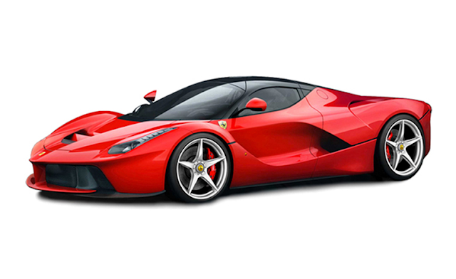
I used illustrators tracer option to edit the magnificent car known as the the LaFerrari. This allowed me to turn the image black and white, then edit it even more by changing the amount of detail like the amount of white there was and white in it and the thickness of the lines, then I proceeded to colour it in using the colour wheel and bucket option and done a nice looking LaFerrari "sketch" if you can call it that.
Screen shot note
Note:
To screen shot a picture you need a something you want to take a screen shot of. For example this small load of books.
Then you proceed to press CMD+SHIFT+4 (in this order)
Then you will need to select the area you want a screen shot of and vuala. You get the screen shot you needed, after that you just paste it on what ever and where ever.
Samuel Pepys
 (Picture)
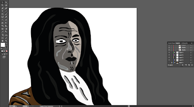 (The Drawing)
This is drawing of Samuel Pepys who documented on some of englands most important historical events like the Great Fire of London, the Great Plague, and the Second Dutch war. I made sure to add a bit more detail to him and his jacket, hair and face for more effect but made sure there is no difference in the art style.
Used multiple lines for more effect, layers and experimentation in the process.
Subscribe to:
Comments (Atom)


