This is my point-of-sale card.
Thursday, 24 November 2016
Test: Outline layers using Appearance panel and multiple strokes
This is my attempt at making multiple stroke outlines, and it proved very useful but this is just a test: I used Illustrators window appearance option to edit its outlines and looks not bad as a test.
Thursday, 10 November 2016
Private project: Obelisk
This was a private project that I was doing, it took me a few weeks to get it to look like this.
The idea was for the project was grabed from the faimous horror game Dead Space, with the obelisk getting scetched on paper then scaned and moved to Adobe Illustrator for editing.
When I finished making the outline by using the pencil tool I proceeded to colour them in, I encountered a problem with the outline being smooth it didnt create the effect I wanted but after changing the lines techture I started to add the details to the obelisk by ading the famous glowing red text.
I drew the lines but in the end they didnt need editing and I proceeded to edit the body of the obelisk to make it more gloomy and old in a way by darkening the lines on it.
When the obelisk was finished I went to edit the background and made it look like a dark orb behind it to add that destructive feel. I added th finishinf touches by adding the explosive orbs to the sides, the sky was also a problem and I fixed it by changing the state of the lines making them seem very "disturbed".
And boom, you have a rather good drawing of a dead space themed obelisk.
Know your styles
Pop art: very comic like, easily recognisable by people when seen.
Anime: easily the most butiful and still very popular style in the world
Thursday, 3 November 2016
Custom flower
So we were tasked with making a flower: you start by making a sircle, roughten it up to a degree you like scale it down or up by using the scaling tool then copy it, maybe change its rotation and edit its colour using the gradient tool and make it a nice litle branch of sorts to stand on.
Picture differances
So here are two versions of the same thing but both are different:
One is high resolution the other is low.
Now spot the difference with this one:
The same differance is with this one.
We had to compare the results as both images were different and as you can see you will be able to notice the differences rather easily if you have good eyesite.
One is high resolution the other is low.
The same differance is with this one.
We had to compare the results as both images were different and as you can see you will be able to notice the differences rather easily if you have good eyesite.
Raster vs Vectors
Raster Images
|
Vector Images
|
·
Created by thousands or
millions of pixels
·
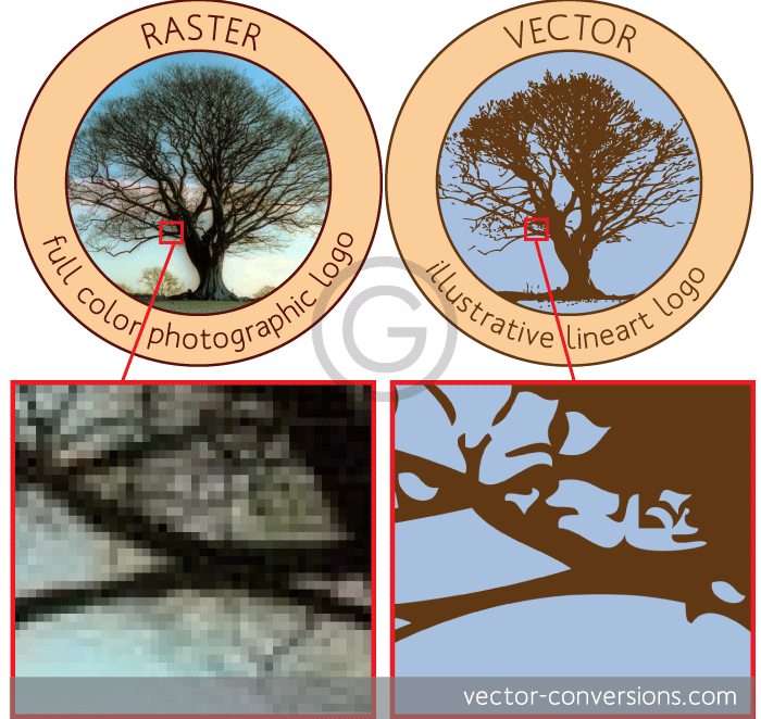
Raster
images are made of pixels.
·
Photographs
are raster images and are probably the best example of images completely made
of color blends - or shade blends in the case of black and white photographs
· Some vector programs do have the ability to create color
gradients within one single shape, but these are actually raster effects.
·
A
raster image has a specific number of pixels. When you enlarge the image file
without changing the number of pixels, the image will look blurry.
·
|
·
Created by using
mathematical calculations
· Images with a subtle gradation of one color to another are
the images that will look most different since vector programs need to create
a separate shape for each shade of color.
·
Vector
images are mathematical calculations from one point to another
·
Vector
graphics can be scaled to any size without losing quality.
·
Not
real (many of them look like cartoon images)
·
EXAMPLE
BELOW OF BOTH:
 |
Subscribe to:
Comments (Atom)


