SOOOO we were tasked with making any of the 50 things with our choice. I choose the motor bike, and its not yet finished but its at most in my opinion at 25% done.
Currently there is still plenty of work to do so the finished version is gonna look much better.
Thursday, 15 December 2016
types of digital art
Types of digital art
in existing media products. Complete the table listing how digital art is used
in the following sectors:
Sector
|
Types
of digital art used e.g. logo etc.
|
Two
Relevant Examples
|
Image/s
|
||||
moving
Image, e.g.
|
Videos, movies
|
The Walking Dead, Naruto, Bleach
|
|||||
e-publishing,
e.g.
|
Books, novels, etc.
|
||||||
web
art, e.g.
|
Pop art, Urban, sci-fi.
|
Travis Lacey, Banksy
|
|||||
digital
Games, e.g.
|
Graphics, animations, charecters, monters.
|
Mass effect, dead space |
|
Thursday, 8 December 2016
Typographic Hierarchy 2
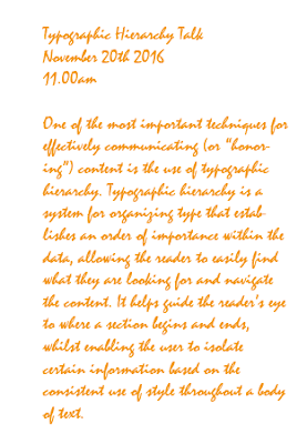
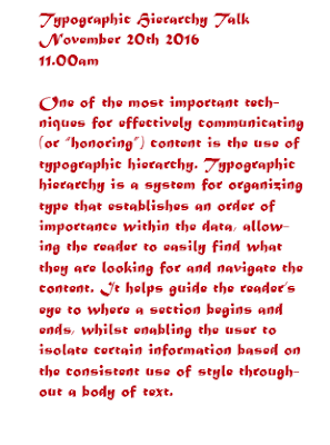
This is the four examples that were last time rather bland, these now have different sizes and styles of writing and as you can see they look very different from before.
Luminari
12PT size.


Minion pro
13PT size.
Uniform stroke 0.35mm.
With black and dark green colours.

Mistral
14PT size.
Orange colour.

Matura MT Script Capitals
14PT size. Red rose colour.
Luminari
12PT size.


Minion pro
13PT size.
Uniform stroke 0.35mm.

Mistral
14PT size.
Orange colour.

14PT size. Red rose colour.
Typographic Hierarchy
Thursday, 1 December 2016
Task by Steve 2
This is a small ammount of the word transform in different forms, one being stretech, the other one being street art or very jelly/stretched.
There are plenty of combinations.
Here is this one with very swampy and muchy look. This time I used the pen tool to make them and not the type tool.
Task by steve
Type design can give your words a (1)voice It can really add meaning and enhance the (2)message of your words. For example, on the Dizzie album they have used some really (3)cheeky and chunky typography here. It not only (4)illustratesthe word but loads it with (5)charecter
and it's great for someone that has personality like Dizzie. In
contrast to this one, I've got the Saturdays album and the typography
here is really (6)elegant and beautifully crafted. It's much much more (7)feminine than the Dizzie one and it works very well with the fashionesque shoot
on the front. In total contrast to my last two albums, I've got the
Prodigy Dirtchamber sessions. They've used found and (8)disstresed type on the front cover and all the way through the album including the booklet where they've hand (9)scratched all the track names into the booklet. And I think this works really beautifully with the (10)mishmashof music that is on the CD.
 The Dizzee album is very "Jazzy" and very colourfull as well as showing the singer himself siting on some comic style rocks.

In this album the whole thing is very "serious" and is actualy really femenin not to mention it shows the whole band siting on a large pair of stairs with their dresses being a bright colour.
 This one is rather different, it doesnt show the band but a rather psychotic "scratching" of things and it kinda gives you an idea of what their music is.
 The Dizzee album is very "Jazzy" and very colourfull as well as showing the singer himself siting on some comic style rocks.
In this album the whole thing is very "serious" and is actualy really femenin not to mention it shows the whole band siting on a large pair of stairs with their dresses being a bright colour.
 This one is rather different, it doesnt show the band but a rather psychotic "scratching" of things and it kinda gives you an idea of what their music is.
Subscribe to:
Comments (Atom)


