Thursday, 22 June 2017
Thursday, 30 March 2017
How to make a logo.
EAs logo is meant to shorten their original name which is ELECTRONIC ARTS.
The logo is very recognizable by many people in the gaming industry and for good reasons... and a lot of bad reasons.
The logo isnt actually that big or small since this is placed on game boxes to mark their property and their logo is actually quite edited since it needed overlapping, shading and glow sometimes.
Its coloration isn’t very surprising since its black and white, but they do change it depending on the game or department that the game was produced. It’s also very modern since this type of company aims to produce games that entertain people. You could mark it as a combination mark which I am not sure of.
To creat this logo you will probably need Illustrator and you will need to set up a page to work on.
Your first step would probably be in my oppinion be to make a cyrcle using the elipse tool and make sure its black. Then you would give it a effect and it would probably be plastic wrap that is located in the artistic section but its honestly your choise on which looks nicer.
The you would make another curcle using the elpise tool make it black very fat. On top of that make another but even smaller cyrcle using the elipse you should also put a artistic texture on it of your choise but I would recomend plastic wraping.
After you do all of this put the logo of EA using the Type tool and select the style of writing that looks nice or acuratly to whats closest to EAs existing logo.
After that you will add a shade to the whole thing by using the drop shadow effect in Stylize.
After this you should technicaly have a EA logo.
Thursday, 23 March 2017
Car animation
Thursday, 16 March 2017
Speaker beats
BALL
Tuesday, 7 March 2017
Thursday, 2 March 2017
Unit 5
A.1
List digitally published products?
|
A.2
How is the product used by the audience? (e.g. inform them)
|
A.3
Where are digitally produced products published?
|
E- NEWSPAPER
|
Used to inform, educate, entertain and they promote and provide advice
|
Online.
|
E-BOOK
|
Used to entertain and educate the reader for example a
kindle.
|
App publishing, Kindle.
|
E-MAGAZINE
|
Used to inform, educate, entertain and they
promote and provide advice this is because the public need to see a wider
range of purposes
|
App publishing.
|
ADVERTS
|
Meant to entertain, educate,
promoting or even providing advice.
For example the trailer for Transformers the last knight: entertains the audience and since there are many fans of the movie it actualy made me and a few people very exited for the movie. |
Online ads, printed.
|
DVD COVER
|
Meant to entertain, educate,
persuade, promoting or providing advice. The TRON movie cover is very cool and made me want to watch the movie. |
Online ads/screenshots
|
INTERACTIVE MEDIA
|
Interactive Media has a tendency to inform because people use
it in that aspect, for example, the bbc news
|
Published on sites like bbc.co.uk
|
Thursday, 23 February 2017
Skateboarder in the hood
Our task was to animate the skate boarder which was rather easy as I shall explain.
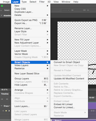 In order to animate him you need to go to layer, smart objects and then convert to smart object. After that you will move him to a position you want him to be in and then embed it.
 In order to animate him you need to go to layer, smart objects and then convert to smart object. After that you will move him to a position you want him to be in and then embed it.
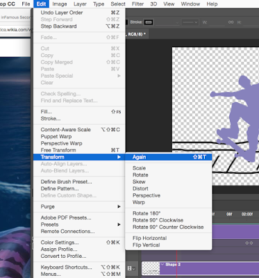
Then you need to go to edit, transform and Flip Horizontal which filps him arround then repeat the same thing again.
Logo types (iStudios) Final ideas part.2
This is the second set of logos I made in illustartor:
1.In these logos I went with a different road of styling, I used the type tool as usual to type the name but I then used the ellipse and direct selection tool to make the pen that’s as you can see is making a line which I made using the paintbrush tool. The style of writting in this one is Tekton Pro and the font style is bold with a size of 169 pt.
2.The second one I made the same way but I wanted to make it look elegant or somewhere close to that, in the end I ended up with something that looks like this. The style of writing in this one is Harrington with the size being 169 pt.
3.The third and final one I decided to make it look very designer like with having a paintbrush made using the ellipse tool and a star which I made using the star tool. The idea came from the Nickelodeon logo which in my opinion fits perfectly. The style of writing in this one is Bauhaus 93 with the size being 169 pt.
Links for logos:
All of these ideas belong to me.
Logo types (iStudios) Final ideas part.1
After I finished with making the logos in paper, this is what I came up with in illustrator:
1.The very first one I made was using the Type tool where I typed in the name of the studio and then changed its text style and color, the symbol I made using the Rectangle tool and then changed its style and color. I grabbed the inspiration from the old Microsoft logo. The style of writing is Century at 205 pt.
2.The second one I did the exact same but I wanted to make it look very sci-fi so I grabbed the inspiration from TRON. The little symbol I made it from the Polygon tool and the Ellipse tool. The style of writing in this one is Braggadocio at 169 pt.
3.The third one I made it using the same way but the color and text style is very different, and the symbol is made using the ellipse tool and the gradient being fiery orange and radial in terms of how the color is positioned. This was something I just came up with. The style of writing in this one is Phosphate with a inline as font style at 169 pt.
4.The fourth is made using the same techniques but again the style or text and symbol are both different, with the symbol being made using the ellipse tool but I made them look like scars using the Direct selection tool. The inspiration was Adidas and monsters (energy drink) logo. The text style in this one is Wide Latin with 122pt in size.
Links for logos:
All of these ideas belong to me.
Thursday, 2 February 2017
Assessment Record sheet Unit 16
ASSESSMENT
RECORD SHEET
|
||||
Programme
|
BTEC Level 1/Level 2 First Extended
Certificate in Creative Digital Media Production
|
Learner name
|
||
Assignment
title
|
I studio Logo
|
Assessor name
|
Steve Butler
|
|
Unit no. &
title
|
Unit 16:
Digital Art for A Media Product
|
Targeted assessment
criteria
|
2A.P1, 2A.M1, 2A.D1, 2A.P2, 2A.M2, 2B.P3, 2B.M3,
2B.D2, 2B.P4, 2B.M4, 2B.D3, 2B.P5, 2B.M5, 2B.D4
|
|
Issue date
|
12th
Jan. 2017
|
Submission deadline
|
3rd
Feb. 2017
|
|
First submission / resubmission?*
|
Date submitted
|
|||
Resubmission
authorisation
by Lead Internal Verifier*
|
Date
|
|||
* All
resubmissions must be authorised by the Lead
Internal Verifier. Only one
resubmission is possible per assignment, providing:
· The learner has met initial deadlines set
in the assignment, or has met an agreed deadline extension.
· The tutor considers that the learner will
be able to provide improved evidence without further guidance.
· Evidence submitted for assessment has been
authenticated and accompanied by a signed and dated declaration of authenticity
by the learner.
**Any resubmission evidence must be submitted within 10 working
days of receipt of results of assessment.
|
||||
Targeted criteria
|
Criteria achieved?
(Yes
/ No)
|
Assessment comments
|
||
2A.P1
|
||||
2A.M1
|
||||
2A.D1
|
||||
2A.P2
|
||||
2A.M2
|
||||
2B.P3
|
||||
2B.M3
|
||||
2B.D2
|
||||
2B.P4
|
||||
2B.M4
|
||||
2B.D3
|
||||
2B.P5
|
||||
2B.M5
|
||||
2B.D4
|
||||
General
comments
|
||||
Assessor declaration
|
I certify that the evidence submitted for this assignment is the
learner’s own. The learner has clearly referenced any sources used in the
work. I understand that false declaration is a form of malpractice.
|
|||
Assessor signature
|
Date
|
|||
Learner
comments
|
||||
Learner signature
|
Date
|
|||
final design (Logo iStudio)
This is the finnal idea I had for the logo for the iStudios project, the idea was strongly inspired by non other than Microsofts old logo. I have made both black and coloured version which allows it to be printed in black and white if need be.
I used multiple colours like red, green, yellow, and very light blue to give it a proper colour scheme.
I also used 3D effects to give it the effect of 3D. I also used the outer glow and gave them their specific colour.
I also gave them the patchwork techture that gives it this old computer system look to it.
I was inspired by: Scher, P. (2002). Make It Bigger, New York: Princeton Architectural Press
Like for example this one here
I used some design deatures from this in order to make the finnal design. As well giving me the idea of the design with the word history in it.
All of the ideas are mine.
The history logo belongs to http://be-artsy.blogspot.co.uk/p/paula-scher.html
Thursday, 19 January 2017
Logo types (iStudios) part 2
EAs logo is meant to shorten their original name which is ELECTRONIC ARTS.
The logo is very recognizable by many people in the gaming industry and for good reasons... sometimes bad reasons.
The logo isnt actually that big or small since this is placed on game boxes to mark their property and their logo is actually quite edited since it needed overlapping, shading and glow sometimes.
Its coloration isn’t very surprising since its black and white, but they do change it depending on the game or department that the game was produced. It’s also very modern since this type of company aims to produce games that entertain people. You could mark it as a combination mark which I am not sure of.
UBISOFTS logo is different from EAs logo since it has an icon on top of its name.
Their logo look like it is a mix of shading and not too many if any at all overlapping since this is placed on games made by them and the logo is about the same size EAs when printed on game boxes.
This also classed as a combination mark.
Links for logos:
Ubisoft: https://www.google.co.uk/search?q=UBISOFT+LOGO&safe=strict&client=firefox-b-ab&source=lnms&tbm=isch&sa=X&ved=0ahUKEwjTioblr87RAhVoLMAKHS4RCScQ_AUICCgB&biw=1920&bih=908#safe=strict&tbm=isch&q=ubisoft+logo+transparent&*&imgdii=j3GxHWI66LG15M:&imgrc=r_8bcwT8st0DrM:
EA: https://www.google.co.uk/search?q=EA+logo&safe=strict&client=firefox-b-ab&source=lnms&tbm=isch&sa=X&ved=0ahUKEwiSi9aFrbDSAhXEBsAKHTtSBRIQ_AUICCgB&biw=1920&bih=902#imgrc=4B0BZS1JgzNOAM:
Logo types (iStudio Logo)
You are
working in the college marketing department and you will produce a range of
design and illustration products for marketing purposes.
Initially
you are asked to design a logo for the new Creative Arts College company
called I Studio. The logo design
will need to be used across several sectors including moving image and web.
You will be responsible for gathering research to brief other members of your
team, staff and learners; presenting initial ideas to them and producing the
final designs in suitable formats.
Logo is a way for a company to make its self known and represent itself, and mark its products with to prevent theft. Its like a copyright act in my eyes.

This image is very formal and business like and would most likely fit a bank in my opinion like for example NatWest.
It is
considered as a Combination mark and with it, it looks more modern.
I includes several bright colors like pink, blue or violet and some brownish
colour possibly bronze.Its shape is also very square with the text remaining nice and smooth, it also may have been made by using drop shadows.
Its texture isn’t much to talk about with it being all flat but it does have some shading in it. The size of this is most likely important because if this logo is used on any type of document then it needs to be relatively big but small at the same time.
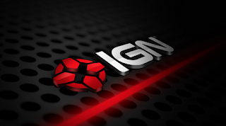
IGN on the other hand have a 3d
logo with an icon and a bundle of effects like shading drop shadows and glow
effects on it. The colors are red, black, white and grey for added effect.
What makes the logo look unique is
that it has its own icon which you don’t see much in modern companies but this
one is a exception.
You don’t really know what IGN does however with just seeing the logo so looking at their website is the best thing if you really want to know what they specialize in, and their work with games. The icon does resemble as cursor for shooting games which may give a clue about it, and it’s very different to the one on top before it in terms of looks. It’s also technically a combination mark as well. Size for this logo doesn’t really matter since its mostly viewed by people online rather than in paper form.
Steinias:
This logo is very professional again but it looks like it would be a Combination mark as it contains both text and shapes.
The texture is very bland again as with the last one, but the amount of colors used isn’t very small with it using light blue (aquatic), black, grey, and violet as well as having been shaded and the background being all darkened in the center and surrounded by a white ring. It could have been made using basic filters or just gentle strokes.
It kind of seems to be used as a chemical producer for dishwasher products or clothes like
A.L Wilson Stain remover.
The guardian logo doesn’t have much in terms of effects or 3d, but it does give you that vibe of a professional news reporter.
The logo does have different colors with them being blue and very light blue compared to the other one on top in which case this classed as a word mark.
And it is quite small in size since this is actually sometimes printed on newspaper.
Links for logos:
THE GUARDIAN: https://mumbrella.com.au/the-guardians-costly-gap-between-traffic-and-profits-349931
Steinias: Was given to us by default.
Veryday: Was given us by default.
IGN:https://www.google.co.uk/search?q=ign&safe=strict&client=firefox-b-ab&source=lnms&tbm=isch&sa=X&ved=0ahUKEwjSr5afjc7RAhWLAcAKHTjOAvIQ_AUICigD&biw=1920&bih=908#imgrc=PevoPRjyEhfeMM%3A
Subscribe to:
Comments (Atom)


