Scenario:
You are
working in the college marketing department and you will produce a range of
design and illustration products for marketing purposes.
Initially
you are asked to design a logo for the new Creative Arts College company
called I Studio. The logo design
will need to be used across several sectors including moving image and web.
You will be responsible for gathering research to brief other members of your
team, staff and learners; presenting initial ideas to them and producing the
final designs in suitable formats.
Logo is a way for a company to make its self known and represent itself, and mark its products with to prevent theft. Its like a copyright act in my eyes.

Veryday:
This image is very formal and business like and would most likely fit a bank
in my opinion like for example NatWest.
It is
considered as a Combination mark and with it, it looks more modern.
I includes several bright colors like pink, blue or violet and some brownish
colour possibly bronze.
Its shape is also very square with the text remaining nice and smooth, it
also may have been made by using drop shadows.
Its texture isn’t much to talk about with it being all flat but it does have
some shading in it. The size of this is most likely important because if this
logo is used on any type of document then it needs to be relatively big but
small at the same time.
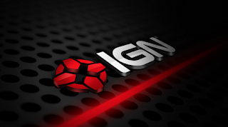
IGN on the other hand have a 3d
logo with an icon and a bundle of effects like shading drop shadows and glow
effects on it. The colors are red, black, white and grey for added effect.
What makes the logo look unique is
that it has its own icon which you don’t see much in modern companies but this
one is a exception.
You don’t really know what IGN does however with just seeing the logo so
looking at their website is the best thing if you really want to know what they
specialize in, and their work with games. The icon does resemble as cursor for
shooting games which may give a clue about it, and it’s very different to the
one on top before it in terms of looks. It’s also technically a combination
mark as well. Size for this logo doesn’t really matter since its mostly viewed
by people online rather than in paper form.
Steinias:
This logo is very professional again but it looks like it would be a
Combination mark as it contains both text and shapes.
The texture is very bland again as with the last one, but the amount of colors
used isn’t very small with it using light blue (aquatic), black, grey, and violet
as well as having been shaded and the background being all darkened in the center
and surrounded by a white ring. It could have been made using basic filters or
just gentle strokes.
It kind of seems to be used as a chemical producer for dishwasher products
or clothes like
A.L Wilson Stain remover.
The guardian logo doesn’t have much in terms of effects or 3d, but it does
give you that vibe of a professional news reporter.
The logo does have different colors with them being blue and very light blue
compared to the other one on top in which case this classed as a word mark.
And it is quite small in size since this is actually sometimes printed on newspaper.
Links for logos:
THE GUARDIAN: https://mumbrella.com.au/the-guardians-costly-gap-between-traffic-and-profits-349931
Steinias: Was given to us by default.
Veryday: Was given us by default.
IGN:https://www.google.co.uk/search?q=ign&safe=strict&client=firefox-b-ab&source=lnms&tbm=isch&sa=X&ved=0ahUKEwjSr5afjc7RAhWLAcAKHTjOAvIQ_AUICigD&biw=1920&bih=908#imgrc=PevoPRjyEhfeMM%3A


