After I finished with making the logos in paper, this is what I came up with in illustrator:
1.The very first one I made was using the Type tool where I typed in the
name of the studio and then changed its text style and color, the symbol I made
using the Rectangle tool and then changed its style and color. I grabbed the
inspiration from the old Microsoft logo. The style of writing is Century at 205
pt.
2.The second one I did the exact same but I wanted to make it look very sci-fi
so I grabbed the inspiration from TRON. The little symbol I made it from the
Polygon tool and the Ellipse tool. The style of writing in this one is
Braggadocio at 169 pt.
3.The third one I made it using the same way but the color and text style is
very different, and the symbol is made using the ellipse tool and the gradient
being fiery orange and radial in terms of how the color is positioned. This was
something I just came up with. The style of writing in this one is Phosphate
with a inline as font style at 169 pt.
4.The fourth is made using the same techniques but again the style or text
and symbol are both different, with the symbol being made using the ellipse
tool but I made them look like scars using the Direct selection tool. The
inspiration was Adidas and monsters (energy drink) logo. The text style in this
one is Wide Latin with 122pt in size.
Links for logos:
All of these ideas belong to me.
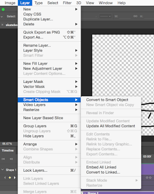
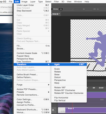
 In order to animate him you need to go to layer, smart objects and then convert to smart object. After that you will move him to a position you want him to be in and then embed it.


