Tuesday, 7 March 2017

Thursday, 2 March 2017
Unit 5
A.1
List digitally published products?
|
A.2
How is the product used by the audience? (e.g. inform them)
|
A.3
Where are digitally produced products published?
|
E- NEWSPAPER
|
Used to inform, educate, entertain and they promote and provide advice
|
Online.
|
E-BOOK
|
Used to entertain and educate the reader for example a
kindle.
|
App publishing, Kindle.
|
E-MAGAZINE
|
Used to inform, educate, entertain and they
promote and provide advice this is because the public need to see a wider
range of purposes
|
App publishing.
|
ADVERTS
|
Meant to entertain, educate,
promoting or even providing advice.
For example the trailer for Transformers the last knight: entertains the audience and since there are many fans of the movie it actualy made me and a few people very exited for the movie. |
Online ads, printed.
|
DVD COVER
|
Meant to entertain, educate,
persuade, promoting or providing advice. The TRON movie cover is very cool and made me want to watch the movie. |
Online ads/screenshots
|
INTERACTIVE MEDIA
|
Interactive Media has a tendency to inform because people use
it in that aspect, for example, the bbc news
|
Published on sites like bbc.co.uk
|
Thursday, 23 February 2017
Skateboarder in the hood


 In order to animate him you need to go to layer, smart objects and then convert to smart object. After that you will move him to a position you want him to be in and then embed it.
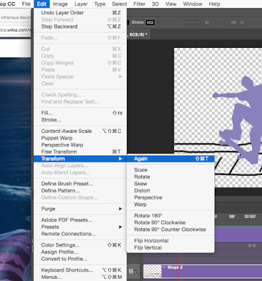
Then you need to go to edit, transform and Flip Horizontal which filps him arround then repeat the same thing again.
Logo types (iStudios) Final ideas part.2
This is the second set of logos I made in illustartor:
 1.In these logos I went with a different road of styling, I used the type
tool as usual to type the name but I then used the ellipse and direct selection
tool to make the pen that’s as you can see is making a line which I made using
the paintbrush tool. The style of writting in this one is Tekton Pro and the font style is bold with a size of 169 pt.
2.The second one I made the same way but I wanted to make it look elegant or somewhere close to that, in the end I ended up with something that looks like this. The style of writing in this one is Harrington with the size being 169 pt.
3.The third and final one I decided to make it look very designer like with having a paintbrush made using the ellipse tool and a star which I made using the star tool. The idea came from the Nickelodeon logo which in my opinion fits perfectly. The style of writing in this one is Bauhaus 93 with the size being 169 pt.
Links for logos:
All of these ideas belong to me.

2.The second one I made the same way but I wanted to make it look elegant or somewhere close to that, in the end I ended up with something that looks like this. The style of writing in this one is Harrington with the size being 169 pt.
3.The third and final one I decided to make it look very designer like with having a paintbrush made using the ellipse tool and a star which I made using the star tool. The idea came from the Nickelodeon logo which in my opinion fits perfectly. The style of writing in this one is Bauhaus 93 with the size being 169 pt.
Links for logos:
All of these ideas belong to me.
Logo types (iStudios) Final ideas part.1
After I finished with making the logos in paper, this is what I came up with in illustrator:
 1.The very first one I made was using the Type tool where I typed in the
name of the studio and then changed its text style and color, the symbol I made
using the Rectangle tool and then changed its style and color. I grabbed the
inspiration from the old Microsoft logo. The style of writing is Century at 205
pt.
2.The second one I did the exact same but I wanted to make it look very sci-fi so I grabbed the inspiration from TRON. The little symbol I made it from the Polygon tool and the Ellipse tool. The style of writing in this one is Braggadocio at 169 pt.
3.The third one I made it using the same way but the color and text style is very different, and the symbol is made using the ellipse tool and the gradient being fiery orange and radial in terms of how the color is positioned. This was something I just came up with. The style of writing in this one is Phosphate with a inline as font style at 169 pt.
4.The fourth is made using the same techniques but again the style or text and symbol are both different, with the symbol being made using the ellipse tool but I made them look like scars using the Direct selection tool. The inspiration was Adidas and monsters (energy drink) logo. The text style in this one is Wide Latin with 122pt in size.
Links for logos:
All of these ideas belong to me.

2.The second one I did the exact same but I wanted to make it look very sci-fi so I grabbed the inspiration from TRON. The little symbol I made it from the Polygon tool and the Ellipse tool. The style of writing in this one is Braggadocio at 169 pt.
3.The third one I made it using the same way but the color and text style is very different, and the symbol is made using the ellipse tool and the gradient being fiery orange and radial in terms of how the color is positioned. This was something I just came up with. The style of writing in this one is Phosphate with a inline as font style at 169 pt.
4.The fourth is made using the same techniques but again the style or text and symbol are both different, with the symbol being made using the ellipse tool but I made them look like scars using the Direct selection tool. The inspiration was Adidas and monsters (energy drink) logo. The text style in this one is Wide Latin with 122pt in size.
Links for logos:
All of these ideas belong to me.
Thursday, 2 February 2017
Assessment Record sheet Unit 16
ASSESSMENT
RECORD SHEET
|
||||
Programme
|
BTEC Level 1/Level 2 First Extended
Certificate in Creative Digital Media Production
|
Learner name
|
||
Assignment
title
|
I studio Logo
|
Assessor name
|
Steve Butler
|
|
Unit no. &
title
|
Unit 16:
Digital Art for A Media Product
|
Targeted assessment
criteria
|
2A.P1, 2A.M1, 2A.D1, 2A.P2, 2A.M2, 2B.P3, 2B.M3,
2B.D2, 2B.P4, 2B.M4, 2B.D3, 2B.P5, 2B.M5, 2B.D4
|
|
Issue date
|
12th
Jan. 2017
|
Submission deadline
|
3rd
Feb. 2017
|
|
First submission / resubmission?*
|
Date submitted
|
|||
Resubmission
authorisation
by Lead Internal Verifier*
|
Date
|
|||
* All
resubmissions must be authorised by the Lead
Internal Verifier. Only one
resubmission is possible per assignment, providing:
· The learner has met initial deadlines set
in the assignment, or has met an agreed deadline extension.
· The tutor considers that the learner will
be able to provide improved evidence without further guidance.
· Evidence submitted for assessment has been
authenticated and accompanied by a signed and dated declaration of authenticity
by the learner.
**Any resubmission evidence must be submitted within 10 working
days of receipt of results of assessment.
|
||||
Targeted criteria
|
Criteria achieved?
(Yes
/ No)
|
Assessment comments
|
||
2A.P1
|
||||
2A.M1
|
||||
2A.D1
|
||||
2A.P2
|
||||
2A.M2
|
||||
2B.P3
|
||||
2B.M3
|
||||
2B.D2
|
||||
2B.P4
|
||||
2B.M4
|
||||
2B.D3
|
||||
2B.P5
|
||||
2B.M5
|
||||
2B.D4
|
||||
General
comments
|
||||
Assessor declaration
|
I certify that the evidence submitted for this assignment is the
learner’s own. The learner has clearly referenced any sources used in the
work. I understand that false declaration is a form of malpractice.
|
|||
Assessor signature
|
Date
|
|||
Learner
comments
|
||||
Learner signature
|
Date
|
|||
final design (Logo iStudio)


I used multiple colours like red, green, yellow, and very light blue to give it a proper colour scheme.
I also used 3D effects to give it the effect of 3D. I also used the outer glow and gave them their specific colour.
I also gave them the patchwork techture that gives it this old computer system look to it.
I was inspired by: Scher, P. (2002). Make It Bigger, New York: Princeton Architectural Press
Like for example this one here

All of the ideas are mine.
The history logo belongs to http://be-artsy.blogspot.co.uk/p/paula-scher.html
Subscribe to:
Posts (Atom)